
Lincoln Memorial University (LMU) is a private institution located in Harrogate, Tennessee. Founded on February 12, 1897 as a living memorial to President Abraham Lincoln, LMU's mission is deeply rooted in his principles of liberty, responsibility, and service to humanity. LMU provides a comprehensive educational experience including programs in veterinary medicine, osteopathic medicine, and law . The university prides itself on its close-knit community, with an average class size of 14, ensuring personalized attention and fostering lasting relationships among students and faculty.
The Ask:
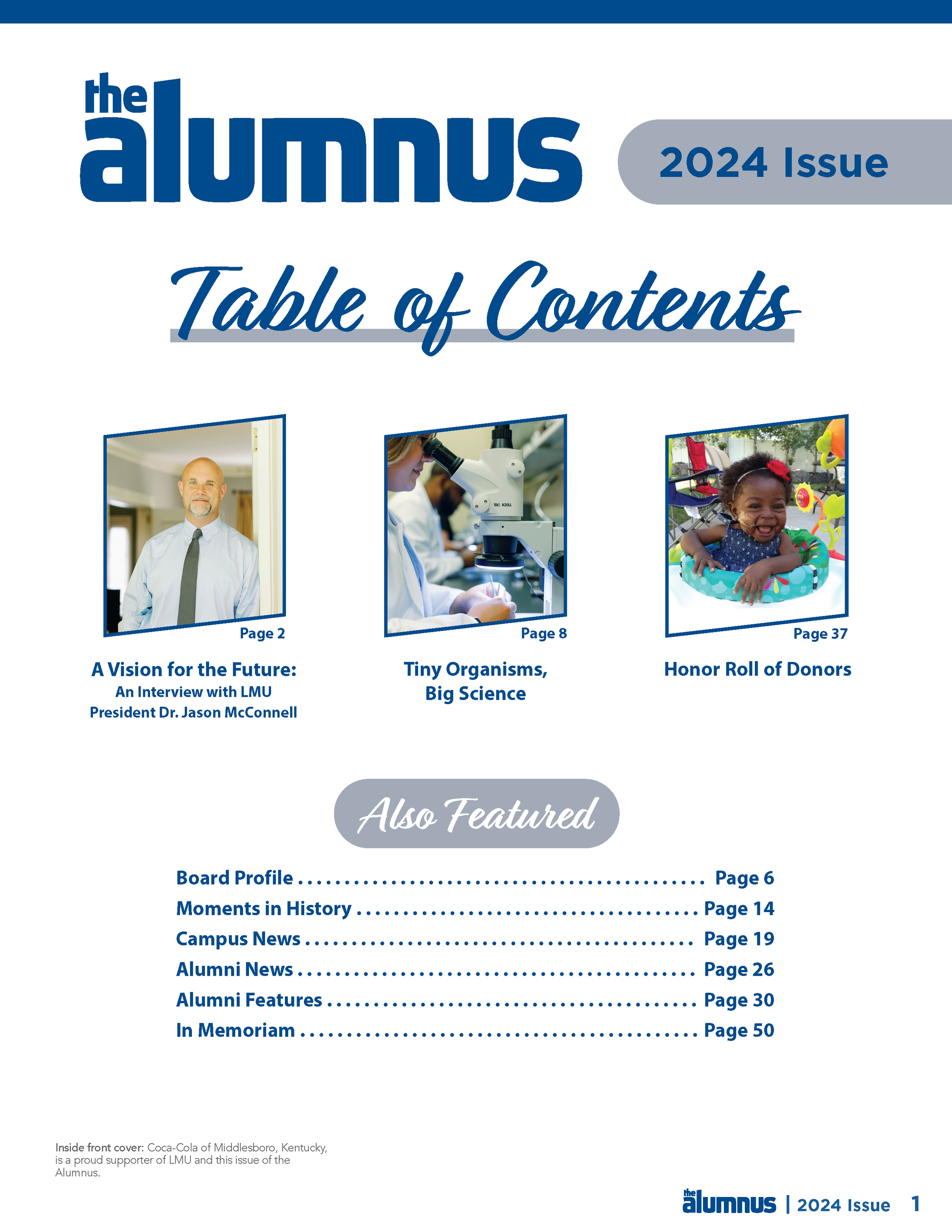
Each year, LMU publishes The Alumnus, a magazine that highlights the institution’s new developments and community stories. This publication focuses on keeping alumni and current students updated on the university’s latest updates. The team at LMU requested that I create a cohesive, informative magazine design for the 2024 issue.
Key objectives:
Create a layout that properly supports text and images
Develop a cohesive design to implement throughout the publication
Present information in a clear and concise manner
The Process:
I began this project by reviewing past issues to get an idea of what the client expects in terms of layout and included information.
What I noticed:
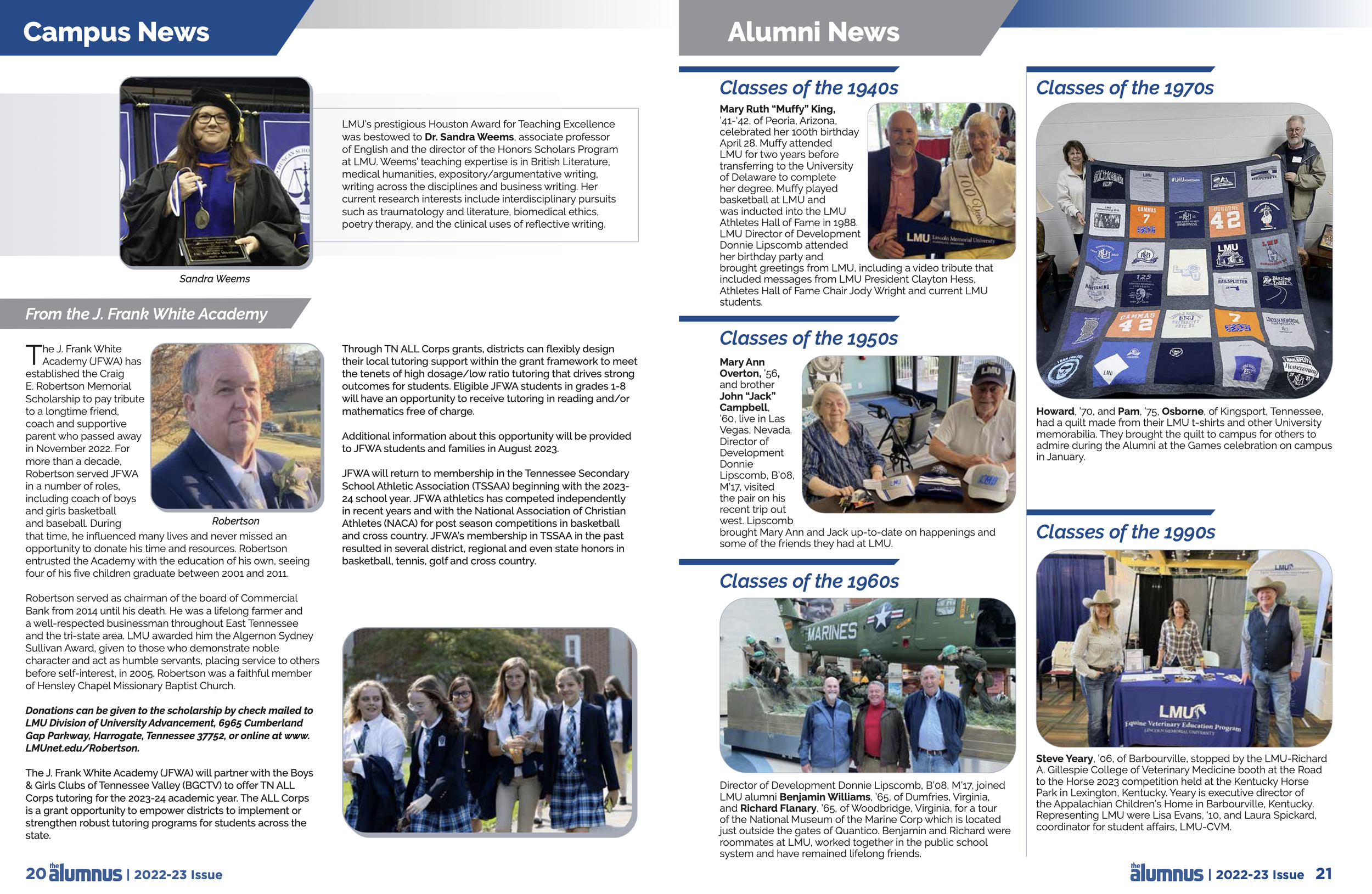
The past issues are content-rich and carry the same design elements throughout.
The university’s colors are present in every section.
The sections remain the same across multiple issues.


Print Design, Publication
Duration: August-November, 2024
Tools: Adobe Illustrator, InDesign, Photoshop
Concept Development:
To maintain the university’s identity while creating a fresh magazine layout, I drew inspiration from other university magazines. Text is a key element in these magazines, so developing a design that supports text well is the highest priority. Geometric shapes and bold titles bring interest to the spreads without distracting from the article. Presenting images in a clear but unique way also adds interest and unity throughout the issue.
Revisions:
After deciding which layout design was preferred, a few revisions were requested by the client.
I varied the section titles to draw interest and reduce repetition.
Bold sans serif and script fonts were used interchangeably to juxtapose the text blocks.
Images were presented in a slanted frame to create visual interest.


Final Publication:
Once the main text was provided, I began adding in visual elements to support the copy. The client requested that I stay true to the school’s identity while refreshing the look and increasing visual interest. I updated the images and events with information the client provided. While upholding the client’s requests, I altered the layout to increase readability and unify the publication.