Hillcrest Healthcare is a nonprofit organization dedicated to providing compassionate, person-centered care across East Tennessee. Founded in 1960, Hillcrest operates three skilled nursing, rehabilitation, and long-term care facilities in Knoxville.
The Ask:
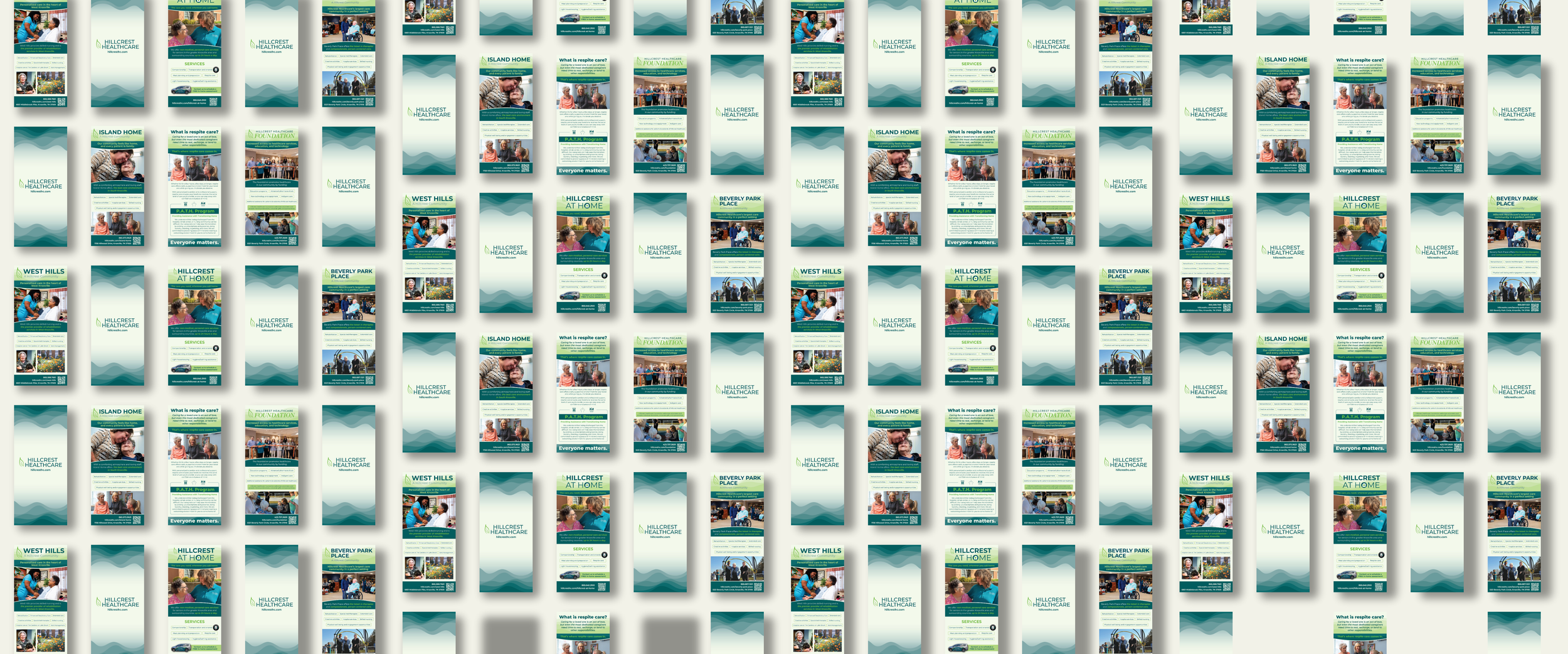
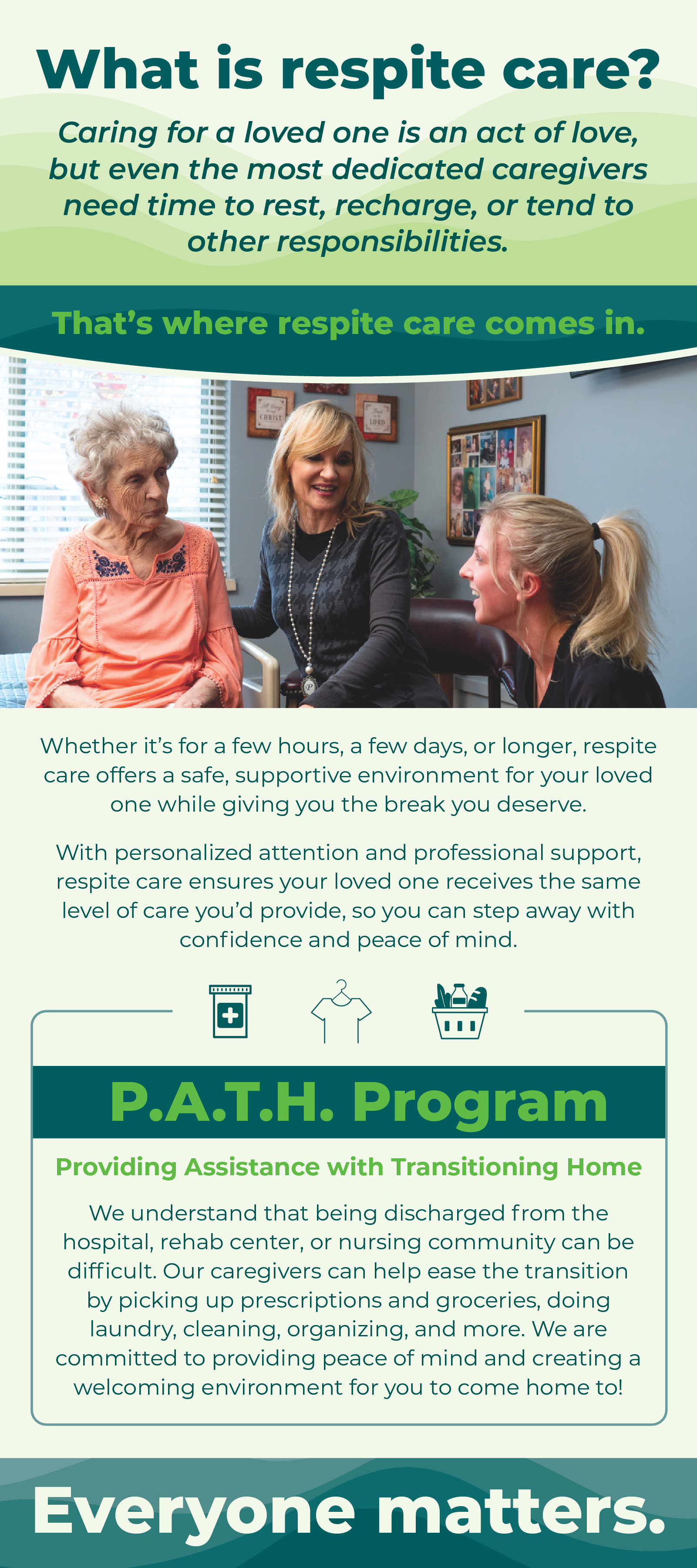
For each Hillcrest Healthcare facility, rack cards are given to prospective clients to share information, and representatives distribute them to surrounding communities. Their current rack cards are dated and in need of a design refresh, which includes new information and images.
Key objectives:
Create an intriguing rack card that supports the organization’s mission and services.
Develop a design layout that is eye-catching, informational, and is successful for all locations.
Use brand guidelines to design a refreshed look.
The Process:
I began this project by reviewing past rack cards to get an idea of what the client expects in terms of layout and included information.
What I noticed:
The rack card is content-rich and includes similar information across locations.
Pictures of actual residents are featured throughout the design.
The brand colors of deep teal and green are heavily used.
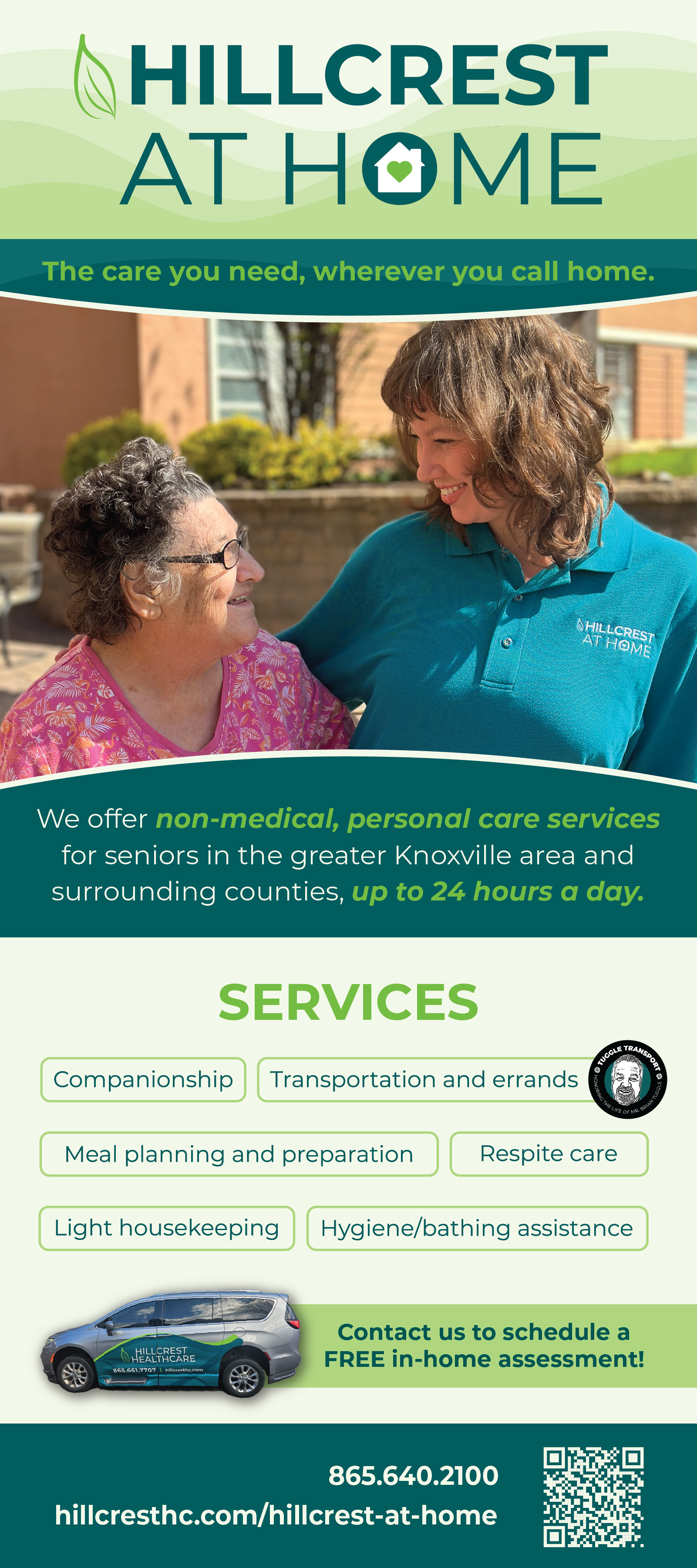
Geometric:
To support a modern, refreshed look, I leaned on soft geometric shapes to support the layout.

Print Design, Brand Identity
Duration: 1 Month
Tools: Adobe Illustrator, InDesign, Photoshop
Concept Development:
To maintain brand identity while introducing a new logo, I developed two main concepts:


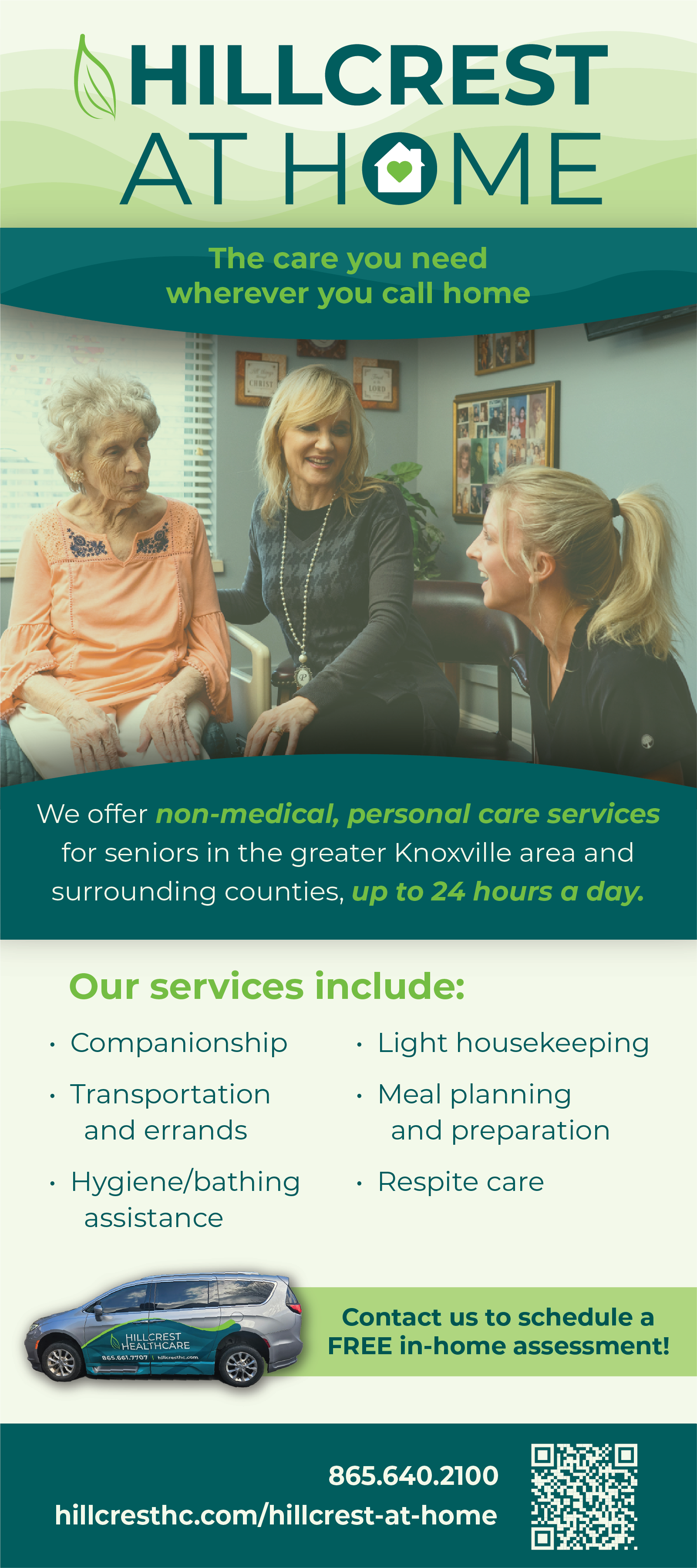
Natural:
To represent the organization’s location, soft waves are used to loosely represent the mountains in which the facilities are nestled.
Revisions:
After selecting which layout was preferred, a few revisions were requested by the client.
Depth was added to the design through the use of drop shadows surrounding the main image.
Information was updated on the back of the card to include information about their PATH program.
Images were updated to include current residents.
The list of services was requested to be changed to a different, more visual format.
Rack Card Design:
Once the layout was finalized, I began updating the rack cards for all locations. I updated the images and information with content the client provided. While maintaining the organization’s brand identity, I altered the layout to increase readability and encourage action.


