

Alzheimer’s Tennessee, established in 1983, is an organization that aims to serve those facing Alzheimer’s disease and related dementias, promote brain health through education, and to champion global research, prevention, and treatment efforts. They raise awareness through annual fundraising and community walks, and offer support groups for caregivers of those facing the disease.
The Ask:
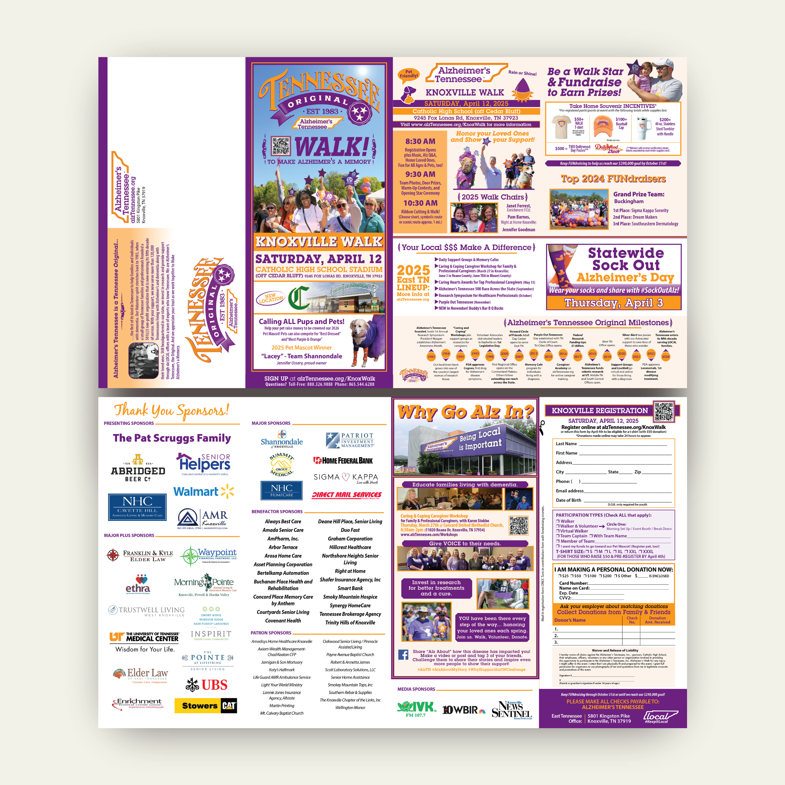
For each annual ‘Walk to Make Alzheimer’s a Memory’ throughout the state of Tennessee, the organization uses brochures and posters to raise awareness and encourage communities to participate. This year, they requested an updated logo that marks Alzheimer’s Tennessee as a ‘Tennessee Original’. The organization needed a logo, brochure, and poster design that would encourage communities to support their annual fundraising efforts. Some limitations for the project include the organization’s branding guidelines, budget, and staggered deadlines.
Key objectives:
Create an intriguing logo that supports the organization’s mission and Tennessee roots.
Develop brochures and posters that are eye-catching, informational, and refined.
Apply the same key elements to all brochures and posters across the state.
Logo Design, Print Design
Duration: 2025
Tools: Adobe Illustrator, InDesign, Photoshop
The Process:
I began this project by reviewing past brochures and posters to get an idea of what the client expects in terms of layout and included information.
What I noticed:
The brochure is content-rich and includes the same type of information each year.
Pictures of past events are featured throughout the design.
The print material is heavily orange and purple to align with the organization’s colors.


Concept Development:
To maintain brand identity while introducing a new logo, I developed two main concepts:
80s Inspired:
Since the organization was established in 1983, the client was interested in having an 80s-esque logo created.
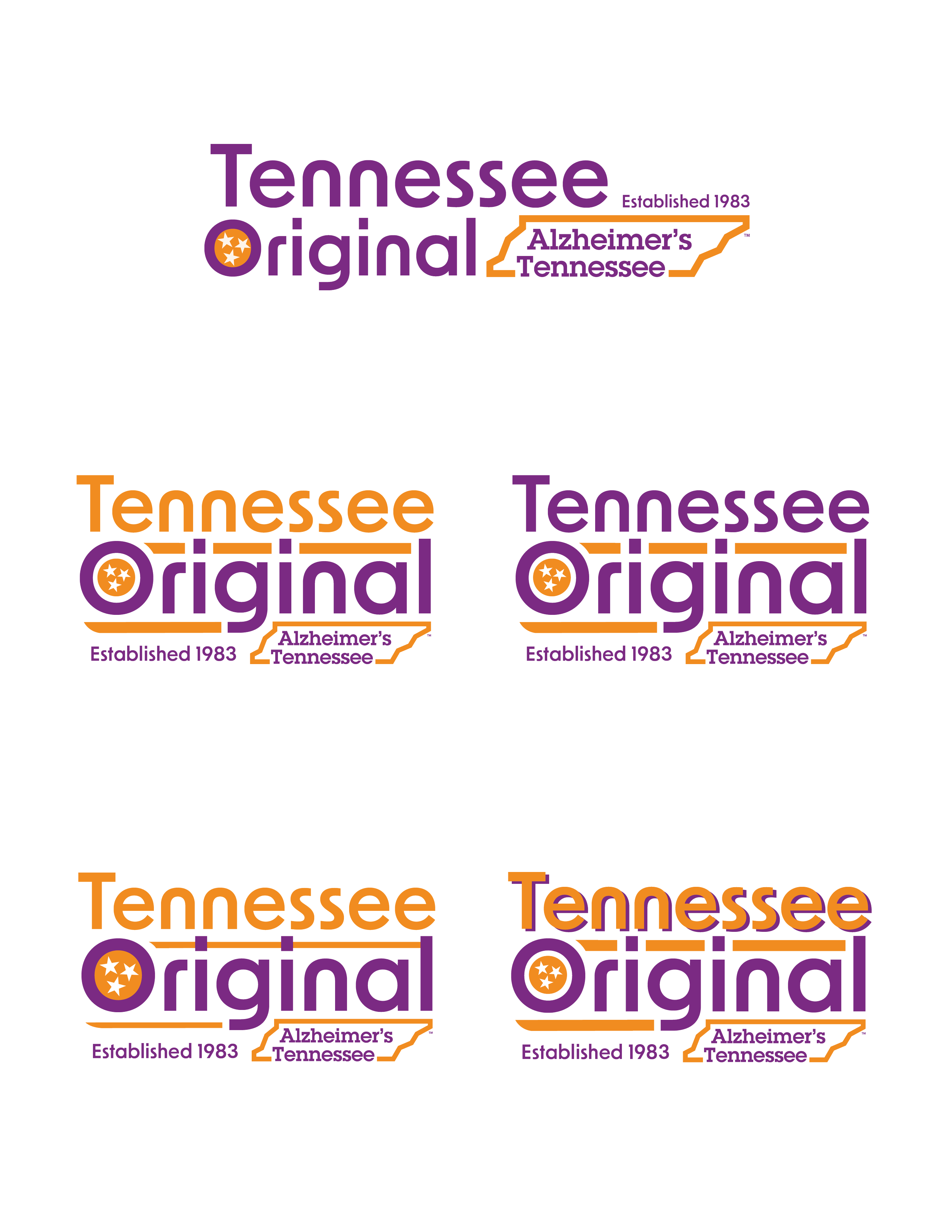
Tennessee Whiskey Inspired:
One of Tennessee’s biggest originals is their whiskey. The client mentioned wanting a logo that has similar typography to that of a whiskey label.

Revisions:
After selecting which logo was preferred, a few revisions were requested by the client.
I added a slight purple drop shadow to “Tennessee” to add dimension and increase vertical balance.
The ‘Established’ ribbon was changed to a Tri-Star stamp.
The main Alzheimer’s Tennessee logo was centered and resized to uncover the purple ribbon.
‘EST 1983’ was added between the ribbon and logo to make use of empty space.

Brochure and Poster Design:
Once the logo was finalized, I began laying out the 2025 brochure and poster designs. The client requested that I use past versions for inspiration while refreshing the look to match the new logo. I updated the images, sponsors, and events with information the client provided. While maintaining the organization’s brand identity, I altered the layout to increase readability and encourage participation.
Final Thoughts:
The refreshed design was well-received by the Alzheimer’s Tennessee team. The logo was placed onto shirts, tumblers, and bags to serve as fundraising prizes. More ‘Walk to Make Alzheimer’s a Memory’ events will continue in the fall, so my work for this project isn’t done yet! I will continue to design Alzheimer’s Tennessee brochures and posters for locations and events across the state.

